Summary

Usability Diagnosis – Heuristic Analysis
Diagnóstico de Usabilidade

Usability Diagnosis – Heuristic Evaluation

Usability Diagnosis – Heuristic Evaluation

How I exposed critical usability issues and created a strategic research roadmap without direct user access

UX Research

UX Research

Heuristic Evaluation

Heuristic Evaluation

SaaS

SaaS

Listen to a podcast about the case (AI-generated).

Listen to a podcast about the case (AI-generated).

0:00/1:34

01

About the project

The platform analyzed is a web application developed for public school teachers and embedded within a larger educational management ecosystem.

As a mandatory tool used across several institutions, it plays a critical role in teachers’ daily workflows. However, the experience failed to reflect the real context of its users: professionals managing high workloads, limited time, and diverse levels of digital literacy.

Meu papel

UX Researcher

UX Researcher

Ano

2024

2024

Ferramentas | Metodologias | Frameworks

  • Figma, Google Forms, Google Sheets, Notion

  • Figma, Google Forms, Google Sheets, Notion

  • Online Surveys, Heuristic Analysis, Workshop Facilitation, Wireframing, Prototyping

  • SCRUM

  • SCRUM

02

Context

Users

Public school teachers

UX Researcher

System Usage

Lesson planning, teaching records, and administrative tasks.

UX Researcher

Reported Issues

Low usability, confusing interaction flows, and inadequate support for user needs.

UX Researcher

Scenario

Large number of complaints and support requests.

UX Researcher

The platform was developed without the involvement of user experience professionals and had been accumulating complaints regarding confusing workflows, missing critical functionalities, and limited user autonomy.

Facing this context, with no previous research and little visibility into who the actual users were, including their age group, digital literacy, access devices, connectivity constraints, and accessibility needs, I designed and conducted an online survey to establish a foundational understanding of our primary persona.

The platform was developed without the involvement of user experience professionals and had been accumulating complaints regarding confusing workflows, missing critical functionalities, and limited user autonomy.

Facing this context, with no previous research and little visibility into who the actual users were, including their age group, digital literacy, access devices, connectivity constraints, and accessibility needs, I designed and conducted an online survey to establish a foundational understanding of our primary persona.

The platform was developed without the involvement of user experience professionals and had been accumulating complaints regarding confusing workflows, missing critical functionalities, and limited user autonomy.

Facing this context, with no previous research and little visibility into who the actual users were, including their age group, digital literacy, access devices, connectivity constraints, and accessibility needs, I designed and conducted an online survey to establish a foundational understanding of our primary persona.

Challenge

The survey was suddenly discontinued for reasons outside the UX team’s control. At that point, the question became: what do we do next?

It was my belief that understanding teachers’ profiles, needs, and expectations was essential to align the product with their mental models, improve usability, and reduce negative business impacts. Given these limitations, I decided to conduct a heuristic evaluation to highlight the main usability issues, eliminate assumptions, and reinforce the urgency of moving forward with research involving real users.

Challenge

The survey was suddenly discontinued for reasons outside the UX team’s control. At that point, the question became: what do we do next?

It was my belief that understanding teachers’ profiles, needs, and expectations was essential to align the product with their mental models, improve usability, and reduce negative business impacts. Given these limitations, I decided to conduct a heuristic evaluation to highlight the main usability issues, eliminate assumptions, and reinforce the urgency of moving forward with research involving real users.

Challenge

The survey was suddenly discontinued for reasons outside the UX team’s control. At that point, the question became: what do we do next?

It was my belief that understanding teachers’ profiles, needs, and expectations was essential to align the product with their mental models, improve usability, and reduce negative business impacts. Given these limitations, I decided to conduct a heuristic evaluation to highlight the main usability issues, eliminate assumptions, and reinforce the urgency of moving forward with research involving real users.

I had an idea!

Tell me!

Since we dont currently have access to users, we could run a heuristic evaluation with the UX team.

Thats great, it would help eliminate assumptions!

Perfect, lets do it!

Exactly! And it would highlight the main friction points

Além de validar tecnicamente as críticas levantadas nos chamados de suporte

Além de validar tecnicamente as críticas levantadas nos chamados de suporte

03

Heuristic Evaluation

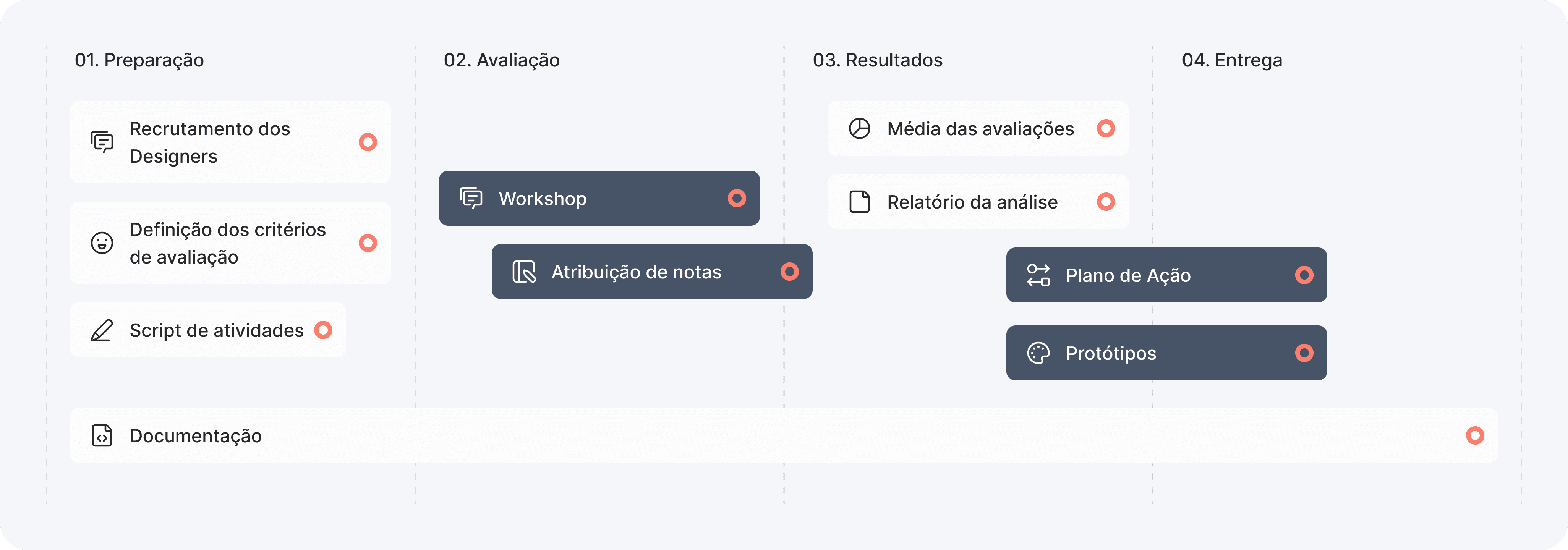
Preparation

“Using Nielsen’s usability heuristics as a foundation, I defined the evaluation criteria, structured task flows based on teachers’ real-world activities, and recruited additional UX Designers within the company to conduct the heuristic evaluation collaboratively.

Preparation

Established evaluation criteria based on Nielsen’s usability heuristics;

Structured task scenarios representing teachers’ primary workflows;

Recruited other UX Designers from the company to participate in the evaluation.

“Using Nielsen’s usability heuristics as a foundation, I defined the evaluation criteria, structured task flows based on teachers’ real-world activities, and recruited additional UX Designers within the company to conduct the heuristic evaluation collaboratively.

Preparation

Criteria.

Criteria.

For each heuristic, I defined evaluation criteria to be assessed and categorized as: met, unmet, or not applicable.

For each heuristic, I defined evaluation criteria to be assessed and categorized as: met, unmet, or not applicable.

→ Visibility of system status

→ Visibility of system status

→ Match between the system and the real world

→ Match between the system and the real world

→ Help users recognize, diagnose, and recover from errors

→ Help users recognize, diagnose, and recover from errors

→ Recognition rather than recall

→ Recognition rather than recall

→ Aesthetic and minimalist design

→ Aesthetic and minimalist design

→ Match between the system and the real world

→ Match between the system and the real world

→ Consistency and standards

→ Consistency and standards

→ Error prevention

→ Error prevention

→ Flexibility and efficiency of use

→ Flexibility and efficiency of use

→ Help and documentation

→ Help and documentation

Task Scenarios.

Task Scenarios.

To make the evaluation more realistic and context-driven, I designed a set of nine task scenarios based on teachers’ most recurring and critical workflows.

The activities were defined using the primary issues reported through support channels, ensuring evaluators experienced representative and high-priority journeys across the platform.

Evaluation Session

I facilitated the workshop with the other UX Designers on the team. Each participant attempted to complete the nine tasks from the script while evaluating the system against the defined criteria.

The designers evaluated each criterion as met, unmet, or not applicable, while also assigning a severity score ranging from 0 to 4 according to the following scale:

Evaluation Session

I facilitated the workshop with the other UX Designers on the team. Each participant attempted to complete the nine tasks from the script while evaluating the system against the defined criteria.

The designers evaluated each criterion as met, unmet, or not applicable, while also assigning a severity score ranging from 0 to 4 according to the following scale:

0

No guideline violations identified.

1

Minor aesthetic issues: address if time allows.

2

Minor usability problem: fixing this should be given low to medium priority.

3

Major usability problem: important to fix and should be given high priority.

4

Usability catastrophes: the functionality/product should not have been released before being fixed.

0

No guideline violations identified.

1

Minor aesthetic issues: address if time allows.

2

Minor usability problem: fixing this should be given low to medium priority.

3

Major usability problem: important to fix and should be given high priority.

4

Usability catastrophes: the functionality/product should not have been released before being fixed.

I facilitated the workshop with the other UX Designers on the team. Each participant attempted to complete the nine tasks from the script while evaluating the system against the defined criteria.

The designers evaluated each criterion as met, unmet, or not applicable, while also assigning a severity score ranging from 0 to 4 according to the following scale:

Evaluation Session

0

No guideline violations identified.

1

Minor aesthetic issues: address if time allows.

2

Minor usability problem: fixing this should be given low to medium priority.

3

Major usability problem: important to fix and should be given high priority.

4

Usability catastrophes: the functionality/product should not have been released before being fixed.

Results

Results

Results

Following the session, I consolidated all participant ratings, comments, and evaluations into a centralized analysis spreadsheet. Each contribution was weighted equally to ensure a balanced and unbiased assessment, based on the most consistent patterns observed among evaluators.

With the analysis complete, it was time to review the findings.

Overview.

Overview.

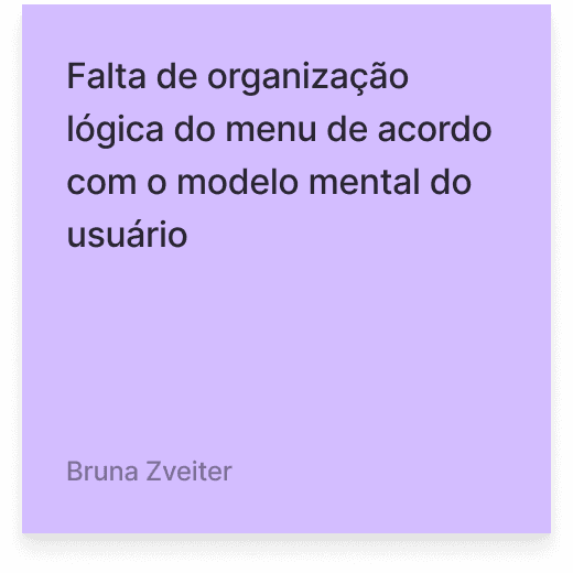
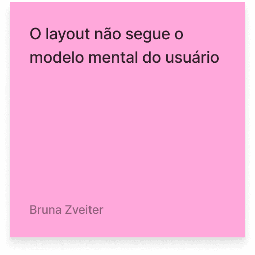
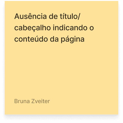
The evaluation revealed multiple inconsistencies across the platform, leading to confusing and unreliable navigation flows. Navigability issues and lack of consistency were identified as the most critical usability problems. User journeys failed to align with users’ mental models, while the interface lacked standardized patterns for components, layouts, and interactions, negatively impacting predictability and overall usability.

Visibility of system status

Match between the system and the real world

User control and freedom

Consistency and standards

Error prevention

Recognition rather than recall

Flexibility and efficiency of use

Aesthetic and minimalist design

Help users recognize, diagnose, and recover from errors

Help and documentation

Among the key findings, I would highlight:

Destructive actions performed without confirmation and risk of data loss due to missing warning messages.

Inconsistent button patterns across the interface, with the same actions presented using different styles and positioning.

Some workflows depended on pre-registered data from other modules or external systems, without informing users of these dependencies or providing access to the required systems.

Dense form structures, insufficient spacing, and visually cluttered interfaces.

Lack of visual feedback and ineffective loading messages.

04

UX Action Plan

User-Centered Design

User-Centered Navigation Flow Reorganization

Address the usability heuristics

Treinamento e recursos de apoio

Feedback contínuo e comunicação transparente

Conduct user research to better understand teachers’ needs, expectations, and specific challenges.

Involve teachers throughout the design process to ensure their perspectives and feedback are incorporated into proposed improvements, reducing rework and development costs.

Conduct usability testing to identify friction points and confusion within navigation flows.

Develop a user journey map highlighting key interaction points and identifying gaps in flow logic.

Organize related activities into logical and intuitive workflows, establishing a clear and consistent structure for teachers’ main tasks.

Ensure the system logic follows the natural sequence of teachers’ real-world activities.

Restructure the interface to be more task-oriented, guiding users through logical steps instead of relying on memory to complete tasks.

Integrate contextual assistance through tips, suggestions, and task-specific guidance. Evaluate the feasibility and potential use of AI-driven support.

Establish consistent interface patterns and interaction behaviors across the platform.

Introduce clear system status indicators, including visual feedback, status messages, and notifications.

Provide real-time feedback for user actions, ongoing processes, and task completion, ensuring users always understand what is happening within the system.

Develop training materials and support resources to help teachers become familiar with the new navigation flows.

Provide interactive tutorials or step-by-step guides within the platform.

Establish effective communication channels to receive continuous feedback from users.

Maintain transparent communication about planned changes, updates, and implemented improvements.
Real Life

As in real life, UX faces many obstacles, and in this case, it was no different… As designers, we learn how to overcome them!

A new urgent demand was prioritized and, once again, we had to postpone the user research phase.

To work around this limitation, I designed Net Promoter Score screens so we could start measuring teachers’ satisfaction right away and build a comparative baseline for the future. In addition, I created volunteer recruitment screens within the system itself, initiating the development of a user pool that will allow us to speed up the next stages as soon as the research can resume.

Real Life

As in real life, UX faces many obstacles, and in this case, it was no different… As designers, we learn how to overcome them!

A new urgent demand was prioritized and, once again, we had to postpone the user research phase.

To work around this limitation, I designed Net Promoter Score screens so we could start measuring teachers’ satisfaction right away and build a comparative baseline for the future. In addition, I created volunteer recruitment screens within the system itself, initiating the development of a user pool that will allow us to speed up the next stages as soon as the research can resume.

Real Life

As in real life, UX faces many obstacles, and in this case, it was no different… As designers, we learn how to overcome them!

A new urgent demand was prioritized and, once again, we had to postpone the user research phase.

To work around this limitation, I designed Net Promoter Score screens so we could start measuring teachers’ satisfaction right away and build a comparative baseline for the future. In addition, I created volunteer recruitment screens within the system itself, initiating the development of a user pool that will allow us to speed up the next stages as soon as the research can resume.

05

Impacts & Learnings

Despite the inability to implement changes immediately, this work:

Helped shape a UX Research and platform redesign roadmap.

Reinforced internally the importance of conducting research with real users.

Had recommendations incorporated into the development prioritization process (including NPS and user recruitment screens).

Influenced the beginning of a UX restructuring process within the product team.

Despite the inability to implement changes immediately, this work:

Helped shape a UX Research and platform redesign roadmap.

Reinforced internally the importance of conducting research with real users.

Had recommendations incorporated into the development prioritization process (including NPS and user recruitment screens).

Influenced the beginning of a UX restructuring process within the product team.

Despite the inability to implement changes immediately, this work:

Helped shape a UX Research and platform redesign roadmap.

Reinforced internally the importance of conducting research with real users.

Had recommendations incorporated into the development prioritization process (including NPS and user recruitment screens).

Influenced the beginning of a UX restructuring process within the product team.

Even in constrained contexts, it is possible to use robust research methods to generate evidence and drive change.

Actively and empathetically listening to users pain points can be a powerful catalyst for transforming products.

Leading a process grounded in ethics, methodology, and interdisciplinary collaboration also helps build trust and foster internal engagement.

Thank you for your attention!

Thank you for your attention!

Vamos conversar sobre o seu projeto!

This case study has been anonymized. The flows, screens, and data presented have been adapted and recreated exclusively for educational purposes.

All rights reserved © 2026 Bruna Zveiter

All rights reserved © 2026 Bruna Zveiter

All rights reserved © 2026 Bruna Zveiter